Original sketches
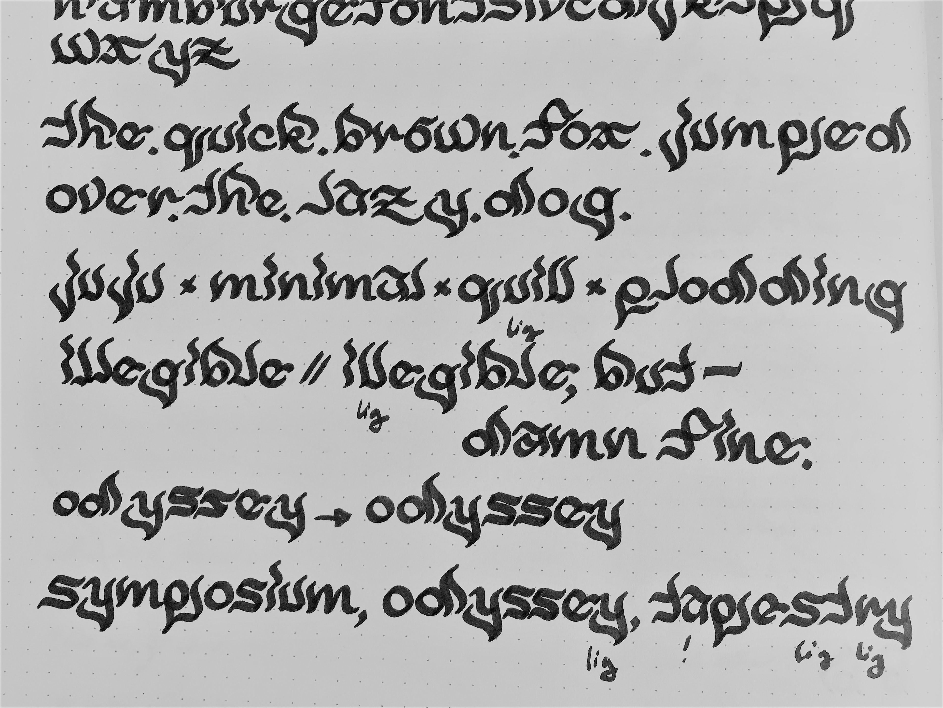
In-class demo
Revisions after in-class demo and conversation with Joel, w/ the goal of really making this font mine!
Revising letterforms for the first three glyphs.
A full alphabet: looks a little too messy and satanic.
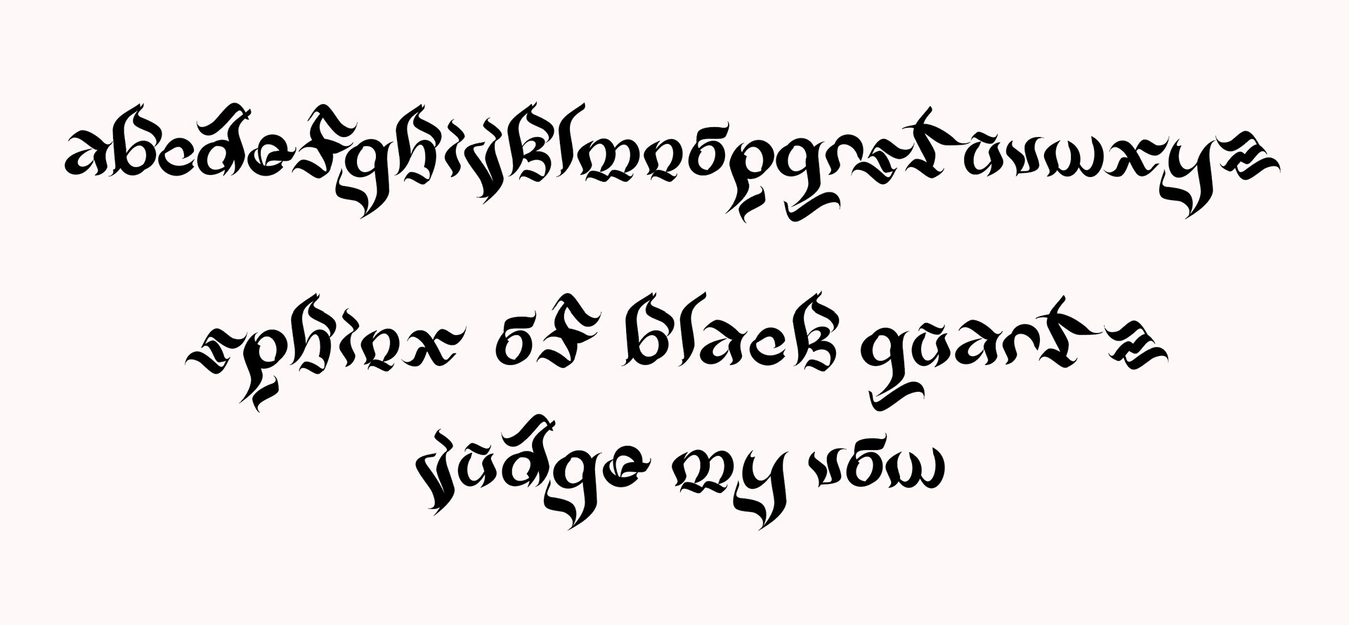
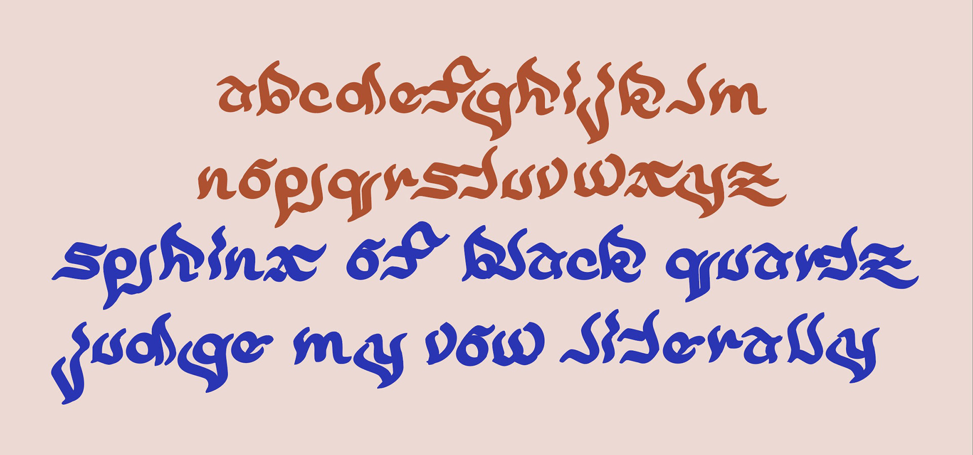
Revised full alphabet: much better, still chaotic but far more aesthetically pleasing in my opinion.
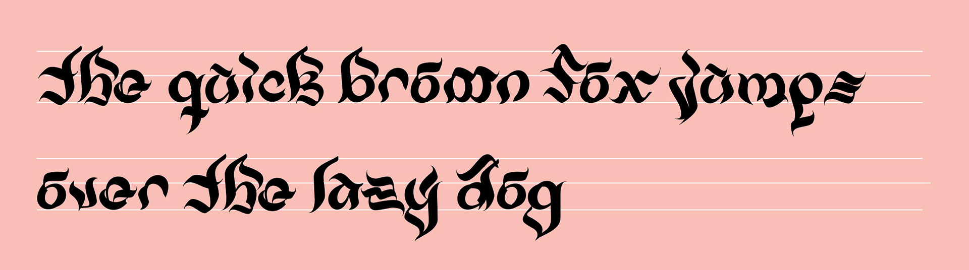
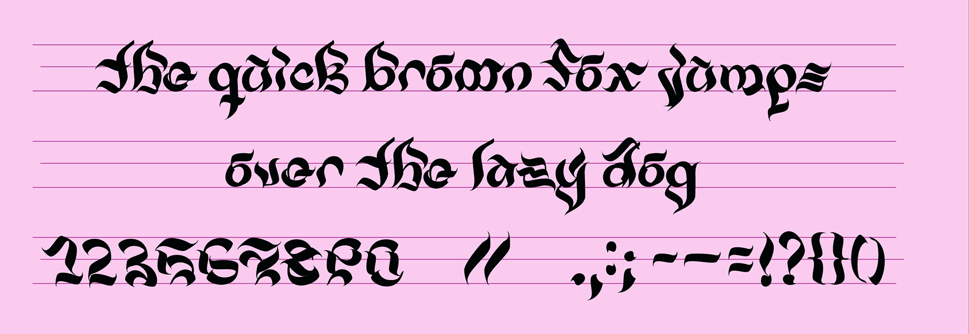
With numerals and some punctuation: