This week, Emily and I developed the designs and held some minimal usability tests on the interfaces for our table of contents and for our 360 comic scene. We planned to also test the VR interactions for our match striking scene, but I was unable to develop that scene sufficiently to test it. It's my #1 priority for this upcoming week to get the ToC and match striking scene into Unity!
Table of Contents UI Test
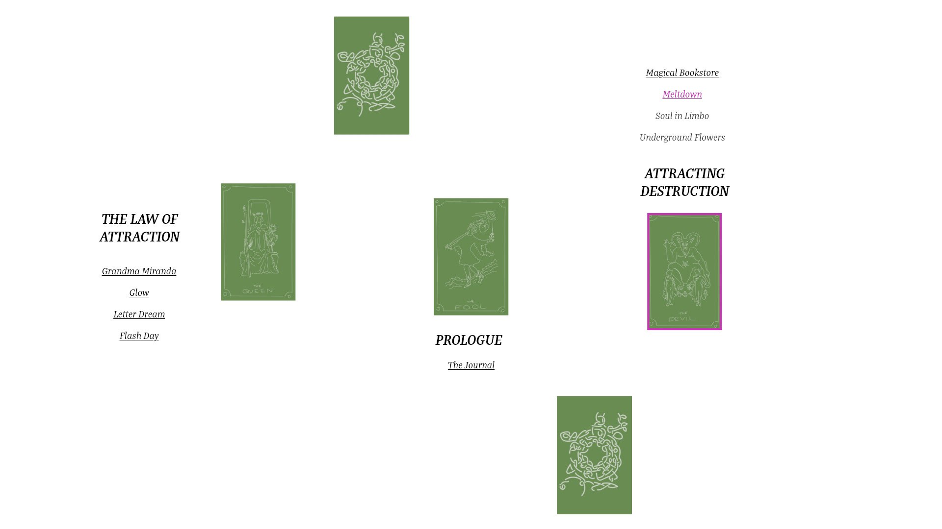
The two of us have determined that we want our table of contents interface to be patterned after a tarot card spread. Each card will represent a chapter of the story, and link to a sub-menu of scenes. Chapters and scenes will be locked until the reader progresses sufficiently through the story. Emily and I made a lot of progress in planning this table of contents and the navigation + emotional build of the full story while planning our user test, and she drew some lovely tarot card designs for us to use!
I created an Adobe XD interactive prototype in 2D to test two different layouts for this table of contents, and wrote an interview script to accompany them. Upon second thought, it was more useful to do the user testing with static artboards, rather than a full interactive prototype. The interactivity will be more useful once I have implemented VR and placed this scene in Unity.
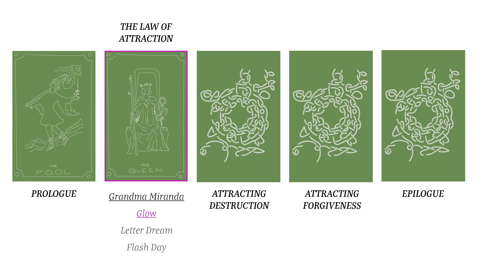
Two different layouts: one linear w/ collapsing menus, one non-linear w/ persistent menus and no preview of upcoming chapter titles. These would be views of the ToC from part of the way through the story. We asked questions such as "Which chapter are you currently reading?" and "Which parts of the story would you be unable to access right now if you tried?" for both layouts. I interviewed five different people about the layouts (two ppl per layout) and received very solid feedback. (still filling in this sheet.) My biggest takeaway was that the difference between scenes and chapters needs to be more clear, as well as the difference between the fronts and backs of cards.
Again, this week (and with these layouts) we have made important progress towards the questions I described in my first version of this blog post: "How will we indicate user progression through the story, such as which scenes are locked and unlocked? How can we lay out the chapter icons in an interesting way in 360 space? Related, how will users pause stories and return to the table of contents? Could we add fun interactions to the table of contents, such as an inventory of items that users collect from the stories? What other menus will we need?"
More or less, our answers right now are "through graphic design and tarot card flipping, by creating a non-linear tarot spread, by pressing a specific button on their controllers, we're not going to do that while we have so much other work to do on the main scenes, and we will need a settings menu controlling aspects such as volume."
Together, Emily and I came up with a new and improved layout order for the cards today. I hope to put the ToC into VR next week and implement raycast highlighting, as in this gif.
360 Comic Layouts UX Test
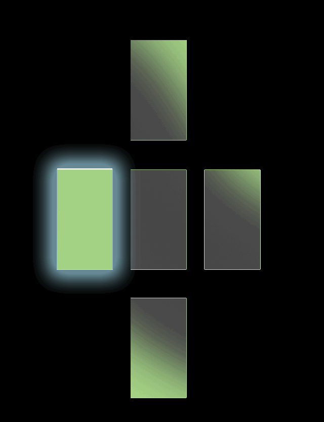
For this test, I was curious about the automatic assumptions users make about reading order when they read a comic in VR. I created some basic layouts of colored squares representing panels, and made them into 360 layouts and 2D images. I then asked several users with Google Cardboard viewers to tell me what they thought the correct reading order would be for one image from each set. See results here (they're still coming in as well.)
For the layouts, I tried to test different reading directions. Do users have an easier time following a story that mostly develops vertically, or horizontally, for example? When there are ambiguous layouts, what assumptions do users make?
I will definitely need more user tests of these layouts before I can draw any conclusions. I have a few more people lined up and will keep asking them for feedback this week! My only major takeaway so far is that one friend assumed the comic should be read from right to left, and we will definitely need some indicators about the directionality.


Example of a layout with a lot of ambiguity, in 2D and as a 360 photo.