Process
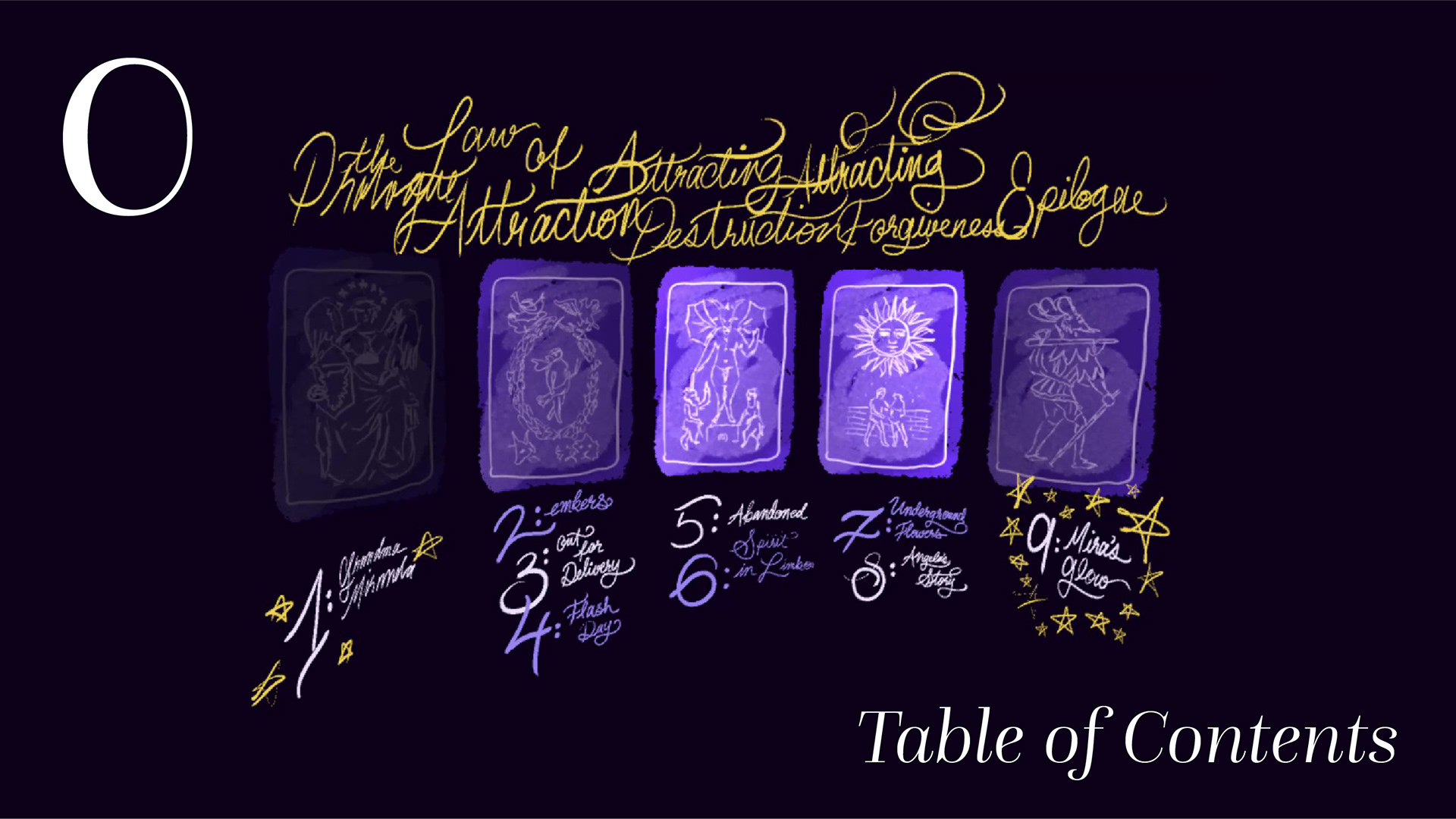
When designing the Table of Contents, Emily and I imagined Mira's journey as a tarot reading: Fool (Mira's naïve beginning,) Empress (Mira's introduction to Miranda,) Tower (Mira's manifestation of negative events,) Sun (her recovery,) World (epilogue.) We eventually realized that this motif might not be obvious to any players who are unfamiliar with tarot mythology if we didn't feature a tarot reading or something similar in the story, and decided to keep it as an unexplained Easter egg and for visual interest.
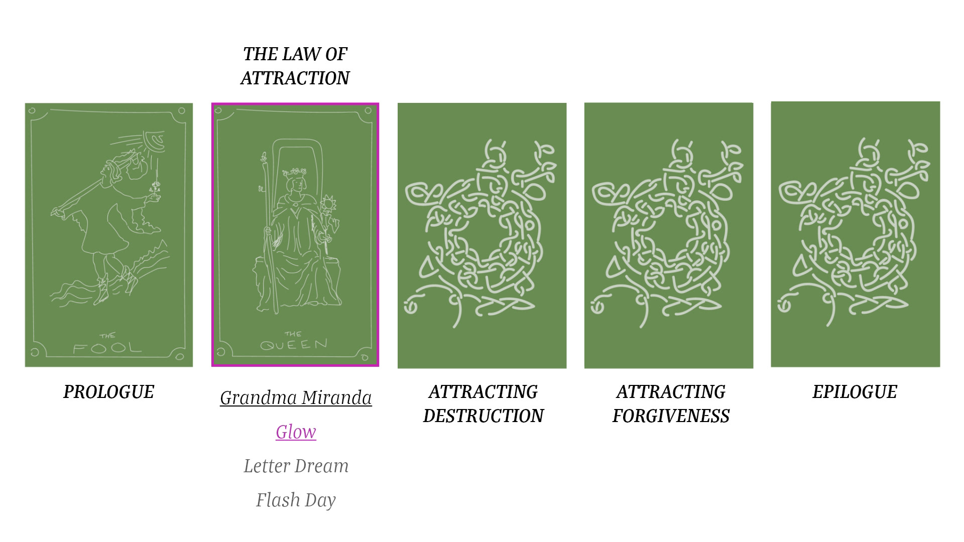
Initial UX testing for the ToC in Adobe XD, exploring different layouts and hierarchies.
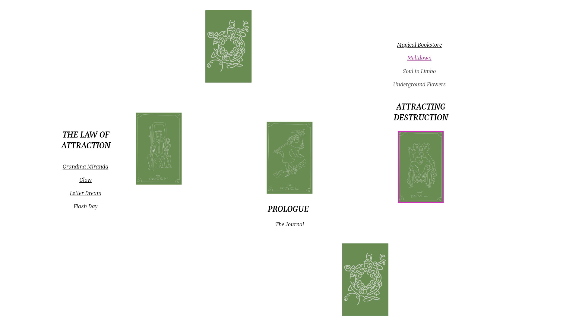
(see previous)
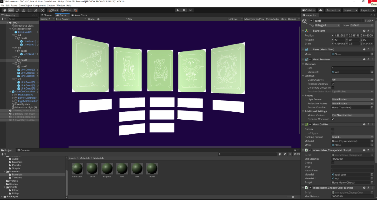
First Unity prototype
I originally didn't plan to use any Quill for this scene, but became so frustrated at trying to get fonts to look good in VR that I decided to write it all out in Quill instead. It turned out very well: the 3D models provide texture and depth in the scene, with tiny stars that appear as a visual indication of highlighting and floating section titles. Emily's new 2D card art is a perfect stylistic match, and I added the images as metallic planes and added a pink directional light to the camera to provide additional highlighting.